Software Carpentry Workshop at UCSB
April 15, 2016
Instructors:
Julie Stewart Lowndes twitter: @juliesquid, github: @jules32
Remi Daigle twitter: @RemiDaigle, github: @remi-daigle
Ben Best twitter: @ben_d_best, github: @bbest
Data scientists, according to interviews and expert estimates, spend from 50 percent to 80 percent of their time mired in the mundane labor of collecting and preparing data, before it can be explored for useful information. - NYTimes (2014)
What to expect
This is going to be a fun workshop. The plan is to expose you to a lot of great tools that you can gain confidence using for your research. We’re going to go through a lot in these two days and you don’t have to remember it all–the main thing to take away is that there are good ways to approach your analyses–and you should have confidence in yourself that you can do find them and use them! Googling is a big part of programming.
We’ll be talking about :
- how to THINK about data. And not just any data; tidy data.
- how to increase reproducibility in your science
- how to more easily collaborate with others–including your future self!
- how the #rstats community is fantastic. The tools we’re using are developed by real people. They are building great stuff and helping people of all skill-levels learn how to use it.
Workshop materials
- Course Website
- Workshop Overview
- Introduction to the Shell
- Introduction to R and RStudio
- Reproducible workflow and Version control with Git, Github, and R Markdown
- Data wrangling in R
- Visualization in R
Tidy data workflow
Hadley Wickham has developed a ton of the tools we’ll use today. Here’s an overview of techniques to be covered in Hadley Wickham and Garrett Grolemund of RStudio’s forthcoming book R for Data Science:
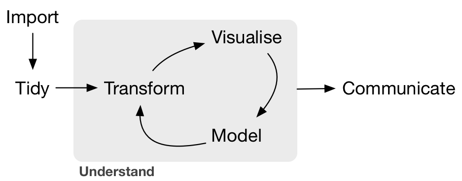
We will be focusing on:
- Tidy:
tidyrto organize rows of data into unique values - Transform:
dplyrto manipulate/wrangle data based on subsetting by rows or columns, sorting and joining - Visualise:
ggplot2static plots, using grammar of graphics principlesplotlyinteractive plots, having hover, zoom and pan capabilities
- Communicate
- online website with Github Pages
- version with git
- dynamic documents with Rmarkdown
Gapminder data:
We’ll be using the gapminder dataset:
Hans Rosling: Gapminder
Gapminder World - Wealth & Health of Nations
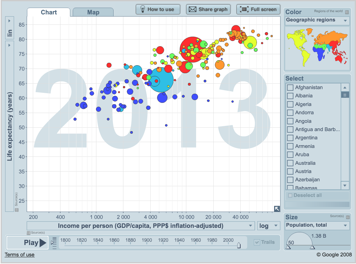
This is not conservation/environmental specific, but it is a fantastically rich data set with many parallels to data you may have and questions you may encounter. There is information for many indicators for every country for many years. You may have many measurements collected for many sites across time. What we learn with the gapminder data will be very relevant to you–especially as we look at certain countries (study sites) or years, or multiple indicators.
By the end of the course…
These teaching materials are nicely displayed online–I made them with GitHub and RMarkdown, which is what we’ll learn to do.
By the end of the course you’ll wrangle the gapminder data, make your own interactive graphic (in R!) that you’ll publish on a website you’ve built with GitHub and RMarkdown. Woop!